
Inspiration
5 Web Design Psychology Tips
When you’re trying to formulate a brand message, you consider the psychology of your target audience. What category of people are you trying to attract with that message? What problems do they have and what solutions do they expect?
Your focus on psychology shouldn’t be limited to the words you use when conveying the brand’s message. You should know about the so-called design psychology, which you’ll implement when creating your website.
There’s a misunderstanding that elegant, minimalistic websites are the only way to go. Yes; they are beautiful. But beauty is not the only parameter of engagement design. You should take a few psychology-backed actions to create the perfect web design layout.
5 Psychology Tips for Good Web Design
First, we need to understand the concept of web design psychology. It’s the process of creating the site that evokes positive feelings among the viewers. What are those feelings? It’s mostly about evoking confidence that you have the right solutions for them. They should feel like you understand them, and you’re capable of helping.
The concept encompasses a few elements of web design:
- Typography
- Colors
- White space
- Content
Every single element of the site has its effect on the visitor. You can manipulate those elements, so you’ll be more likely to achieve the desired effect.
Let’s start with the website design tips.
- Trigger Emotions through Colors
Color psychology is a complex niche. It’s not a definite science, but it makes a lot of sense when observed how colors affect the majority of people. They have an effect on our behaviors, feelings, and mood.
These are the main rules to remember:
- White is often associated with innocence and purity
- Black may mean unhappiness, but it also evokes professionalism when combined with other colors
- Purple is the color of mindfulness, wisdom, and wealth
- Pink is for romance
- Orange and yellow are warm, energetic colors that evoke happiness and enthusiasm
- Red is for passion and love
- Blue may evoke sadness or calmness, depending on its depth
- Greek is often associated with money, but it’s also the color of nature and “cleanliness”
- Brown is the color of strength and credibility
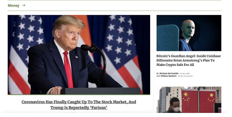
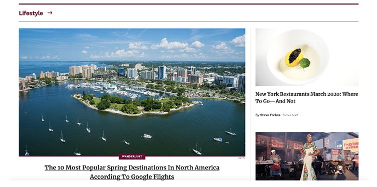
Let’s take a look at an example: the Forbes website. It uses different colors to distinguish different categories. Green is for money, purple is for lifestyle, and brownish/greenish is for leadership. It seems like the web designers were in tune with the psychology of colors.

Screenshots 1, 2 and 3. Source
We have to keep in mind that there’s not too much research in the niche of color psychology. However, in the world of marketing, it’s a well-used concept that works. You don’t have to stick to these rules, but it’s good to have them on mind when wondering how to design a website that would resonate well with your audience.
2. Establish Trust and Confidence
If your website asks for personal information, the visitors will be triggered. “Will they keep my details safe? Is it safe for me to share card details here?” Your website has to answer these questions through the design itself.
No; you won’t write something like: “It’s okay, you can give us your bank details.” You will make the site fast and professional-looking.
These tips will help you earn trust:
- Featuring a security certificate is a good idea. State any protection that your site provides through a payment gateway or a third-party SSL.
- When business owners create a website for free, they tend to use templates without much customization. That’s a mistake. Use a great template and play with it. You want your website to look unique if you want it to earn some reputation.
- Have a clear purpose for each page. It should directly answer questions and provide solutions. Don’t feature too much content with SEO purposes. Your landing pages should be on-point. You can infuse some keywords, but leave the long-form content for your blog.
- The contact information should be easily available. If anyone has questions before providing personal details, they should receive guidance from the customer support department.
3. Use Hick’s Law in Your Design
The Hick-Hyman law (or Hick’s Law in short) tells us that your target audience will make a faster decision if you don’t overwhelm them with too much information. It’s simple: if you give more choices for a potential buyer, they will need more time to consider them.
Psychologists Mark Lepper and Sheena Iyengar proved how the law worked through their jam study. One display at the food market offered 24 varieties of jam. The other day, the display featured only six varieties. The analytics showed that the targets who saw the smaller display were one-tenth more likely to make a purchase when compared to those who saw the bigger display.
What does this mean for your website?
- Include a single product per page
- Do not feature too many clickables on a single page
- Categorize the products in smaller groups
- Do not overwhelm the suggestions; feature only the most relevant ones
This doesn’t mean that you shouldn’t feature too many products on your site. If you have a huge offer, it’s okay. However, make sure to clarify what each product is for, so there won’t be any confusion.
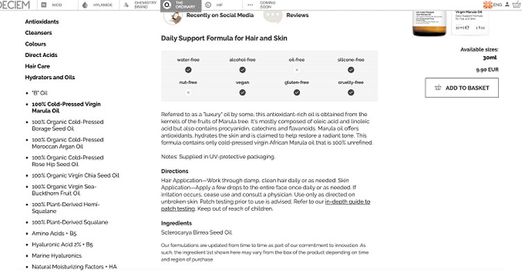
Take The Ordinary as an example. The site is a bit confusing, and people need more time to analyze the products before they buy them. It’s because the website offers too much information, but not enough clarity. The brand is hugely successful, but there’s a lot of confusion around it. The many questions on forums, lengthy blog posts with explanations, and dedicated YouTube videos say enough. People take a lot of time to decide what to buy, and they often make the wrong decisions.
Screenshot 4. Source
4. Mind the Typeface
TYPEFACES ARE AN ESSENTIAL ELEMENT OF DESIGN!
Oh; sorry for yelling!!!
You already know that bolds, italics, and capitals are used for emphasizing words, as well as for expressing your tone. However, the font’s design also makes a difference.
- Comic Sans and other weird fonts are a big no-no for a serious website. They are fun for children’s books, and that’s about where their use ends.
- San-Serif fonts are okay. These are fonts that don’t use the serif – the small line at the end of a character. They include Arial, Helvetica, and many others. They are great because they have a modern, minimalistic appearance. They are also easy to read.
- Serif fonts are readable, too. They are classic, and they are often used by news sites. They include Cambria, Times New Roman, and other classics.
5. Use Psychological Triggers
When you design a website, you want to trigger some kind of reaction with it. You want people to subscribe, make a purchase, share, like… you know your goals.
You want to develop a design that talks not only to the intellect of the viewer, but to their deeper, inward feelings as well. You want to trigger the subconscious level, so the action will result as an instinct.
I know; a lot of theory and not much practical advice. Here it comes:
- Make people feel good about the decision they are about to make. You can do this by featuring visuals of happy people. But make those visuals relevant and realistic. If you’re trying to convince them that they will overcome an issue, feature before-and-after images of people who managed to do that through your tips.
- Testimonials are also effective. However, they have to be real. Feature real names and experiences; not fabricated snippets that look tacky instead of professional. Your audience can see right through such practices.
Psychology Is Not Easy
Not everybody reacts the same way to the same stimuli.
That’s why it’s impossible to give precise tips that would work in every single case. However, it’s safe to say that the tips listed above will work for the majority of websites.
You still need the factor of uniqueness. Following the concept of color psychology doesn’t mean that you have to use the same colors as every other website in your niche. Take these tips as suggestions; not rules.


5 Comments